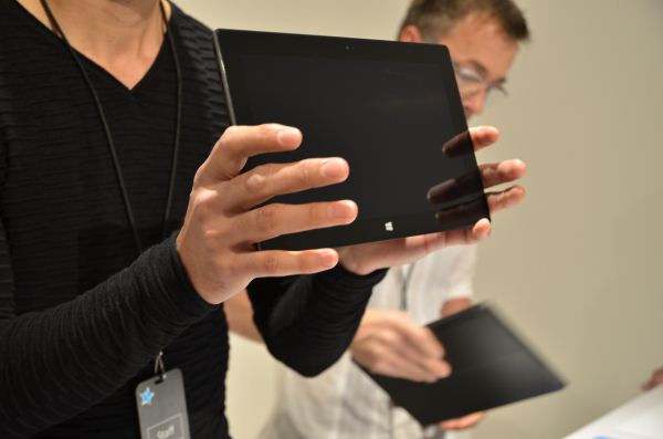
Post-announcement, Microsoft took us to a backroom in Milk Studios to give us hands on experience with the Surface. They weren't lying, even the preproduction units feel awesome in hand. The magnesium panels are finished with partial vapour deposition, a process that deposits a thin-film coating onto the panel using vacuum deposition (molecule-by-molecule deposits at sub-atmospheric pressure.) It gives the unit a distinctly premium feel, and one that's pretty different from most of the other metal-bodied systems out there particularly with the current trends towards anodization and brushed finishes. The body is 9.3mm thick (a tenth of a millimeter thinner than the latest iPad), and total weight comes in at 676g (or about 1.49 lbs), so it's denser feeling than the iPad.. The 31.5Wh battery isn't as large as the iPad's 42.5Wh, but the 1366x768 10.6" LCD definitely draws less power.
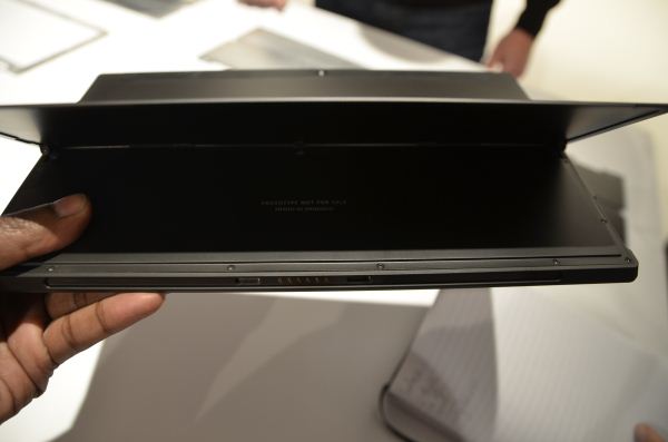
The hinges in the kickstand are spring-loaded, giving a very positive mechanical feel and noise. The hinge mechanism is particularly robust, and as mentioned in the keynote, was acoustically tuned to sound high quality. Microsoft seemed particularly OCD about certain design details, this being one of them. It paid off though, with a hinge that looks and feels ready to take a lot of abuse. The stand props the system up at 22 degrees, which is a common theme - the beveled edges are all angled at 22 degrees, and the rear camera is also angled at 22 degrees in the opposite direction. This is a pretty interesting one, since it means you can keep the tablet angled as is usually comfortable, and still shoot video straight ahead. It's a good idea, though probably one that will take a bit of adjustment in real life use.
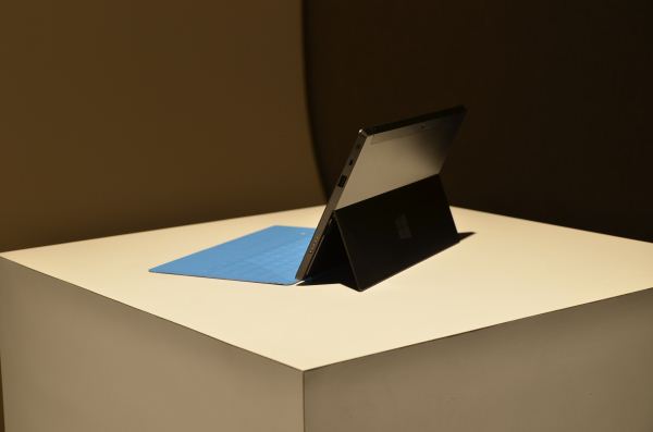
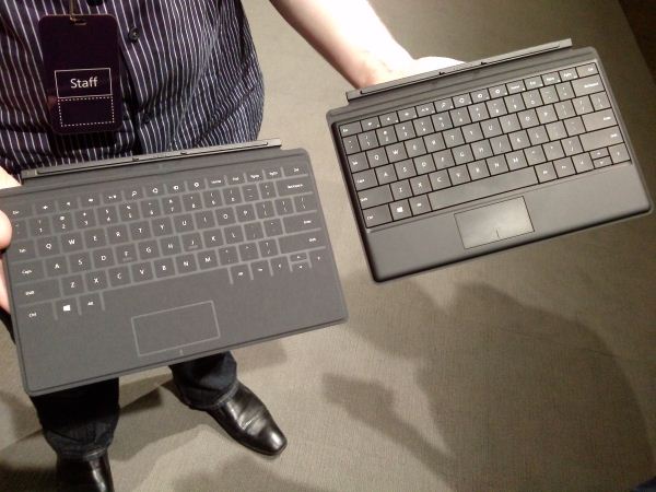
My personal favourite part of the Surface is the cover. There's two of them - the Touch Cover, and the Type Cover, both with integrated keyboards and touchpads. The Type Cover has a traditional keyboard, albeit one with particularly shallow feel, along with physically clicking mouse buttons. The Touch Cover is very interesting - it has a pressure sensitive membrane keyboard with felt keys and mouse buttons housed in a cover that's totally 3mm thick. (The Type Cover is ~5.5mm thick). I wasn't able to get a feel for how typing actually feels on it, so I can't comment on responsiveness or accuracy, but our friend Ben Reed at Microsoft Hardware swears he can top 50 words per minute on it any given day. I'm inclined to believe him, but I can't comment firsthand until I can actually play with a working unit.
The outside of the covers is covered in a felt material, and when closed, the unit feels like one of the velour or felt-covered journals. It gives a decidedly organic, natural feel to a very inorganic device, something that Microsoft was very pleased to note. It's a pretty awesome idea, actually, taking the best parts of Apple's Smart Cover and ASUS' laptop dock and merging them together into one of the most innovative cases we've seen. I took away three major things from this event, and the only one them that directly related to the device hardware being shown off was that integrating the keyboard into the cover was a stroke of awesome. (I'll go more in depth on the others in a larger post later today.)
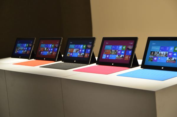
For the first time, I can really see a tablet replacing a notebook as my primary computing device. Before today, I couldn't say that with any real conviction - I tried it with the iPad on multiple occasions, and it just didn't work. I'm a writer, tablets aren't ideal for writing. Surface changes that in a big way. And that's really what Microsoft is going for here - a device that fits into your life as a versatile tool to do anything you want it to. Whether they'll succeed in capturing the market is a story that will be told after Surface launches alongside Windows 8 later this year, but for now, this is a very promising start.


No comments:
Post a Comment